Reading Color Pallet in Iznik Tile
Discover the mission of Cobalt blue, turquoise, green and red in the period, technical and composition.
In this article3
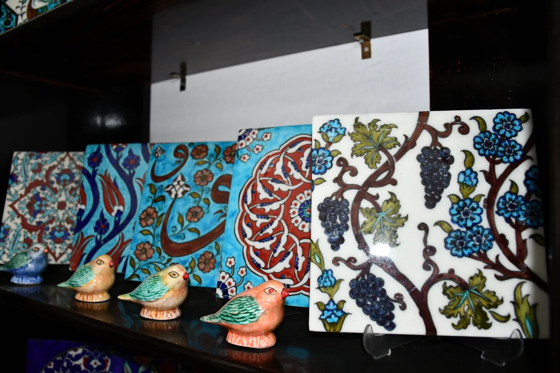
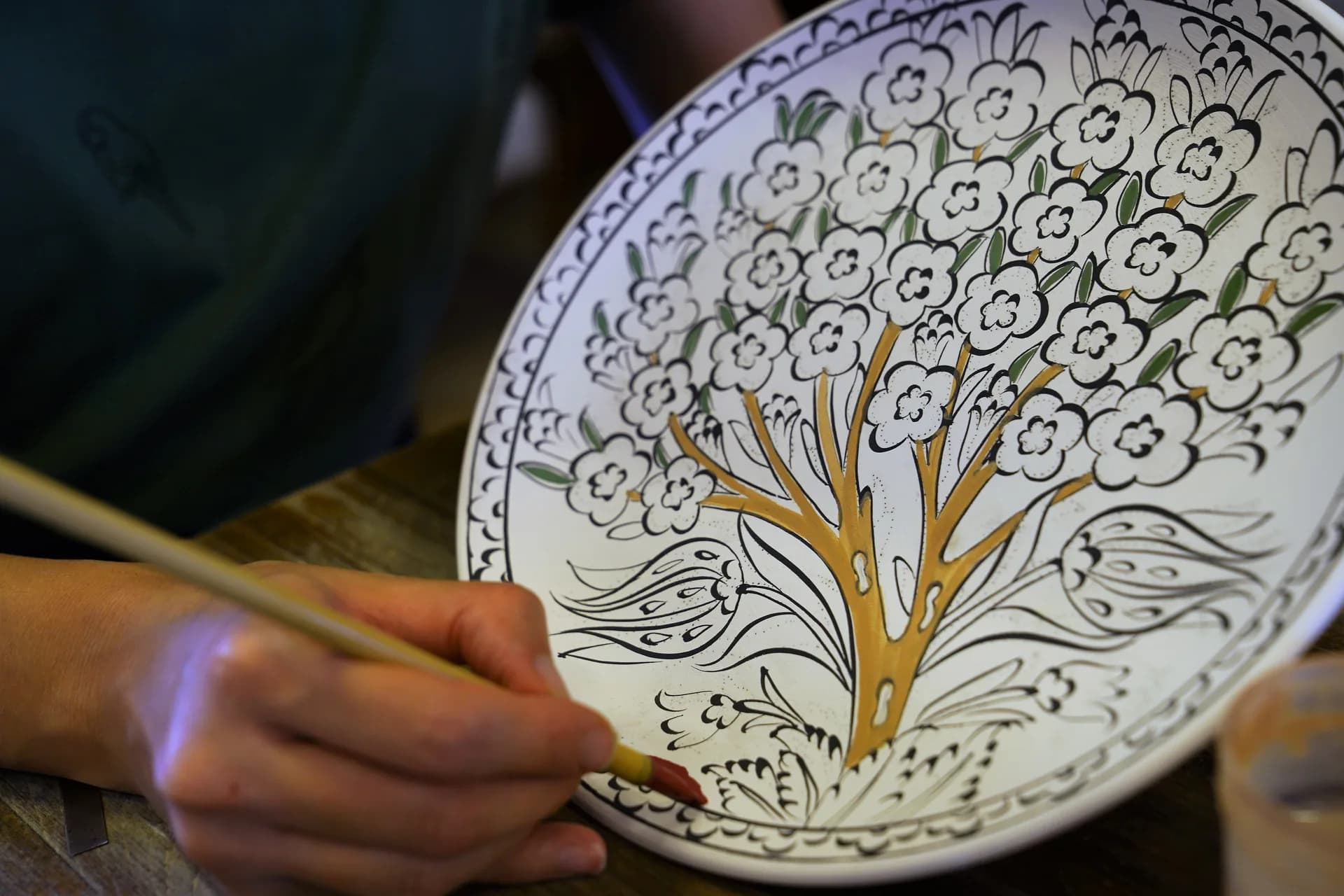
The colors of the Iznik tile are not only a decorative choice; separates the layers of pattern, highlight the flower with the leaf and balance the gaps.
Note that the color can look different on the screen, museum light and natural light. Take into account the reflection and aging on the secret surface while assessing tonu.
Blue and turquoise
Cobalt blue responds to turquoise more clearly when installing strong contours and large areas. Two tone side can create a sense of depth.
The task of green
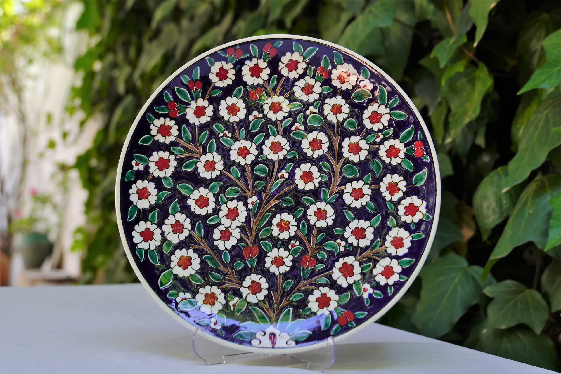
The green vegetable composition used in leaves and stems connects together; it balances around dominant colors such as red.
See All
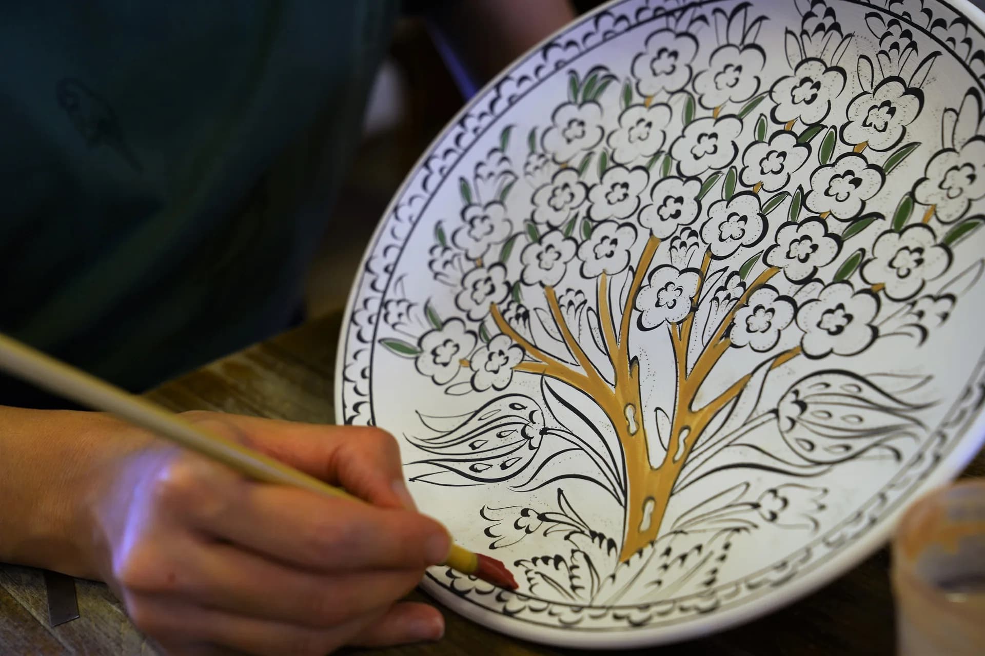
Remotely examine the plate or tile before approaching a single color. The success of the pallet is understood in many of the pigments.
Continue reading